A trend is your friend: the latest unemployment and poverty numbers
In this presidential election year, the public seems particularly focused on the monthly unemployment statistics gathered by the Bureau of Labor Statistics (BLS). By now I am sure we all know how it works:
If the numbers are bad:
The Republicans tout the numbers as proof that Obama is destroying the economy, and Democrats make an attempt to assure everyone that one month’s numbers don’t mean anything.
If the numbers are good:
The Democrats tout the numbers as proof that Obama is improving the economy, and Republicans make an attempt to assure everyone that one month’s numbers don’t mean anything.
Last month’s unemployment rate dropped to 7.8% from 8.1% in August. Is this drop extraordinary? No. Will the unemployment rate continue to drop? Maybe. Is this a left-wing conspiracy to make Obama look good in the last few months of the campaign? Absolutely not. Let me explain…
One of the most often used expressions in my line of work is “a trend is your friend.” Statistically speaking, what this means is that one cannot make reasonable inferences from one number when that number is drawn from a survey that is prone to various types of error. Instead, statisticians (at least the good ones) like to see big trends before they feel confident about making any type of solid assertions.
So what are the big trends in employment? How about we start by looking at the unemployment rate since Obama took office in January of 2009:
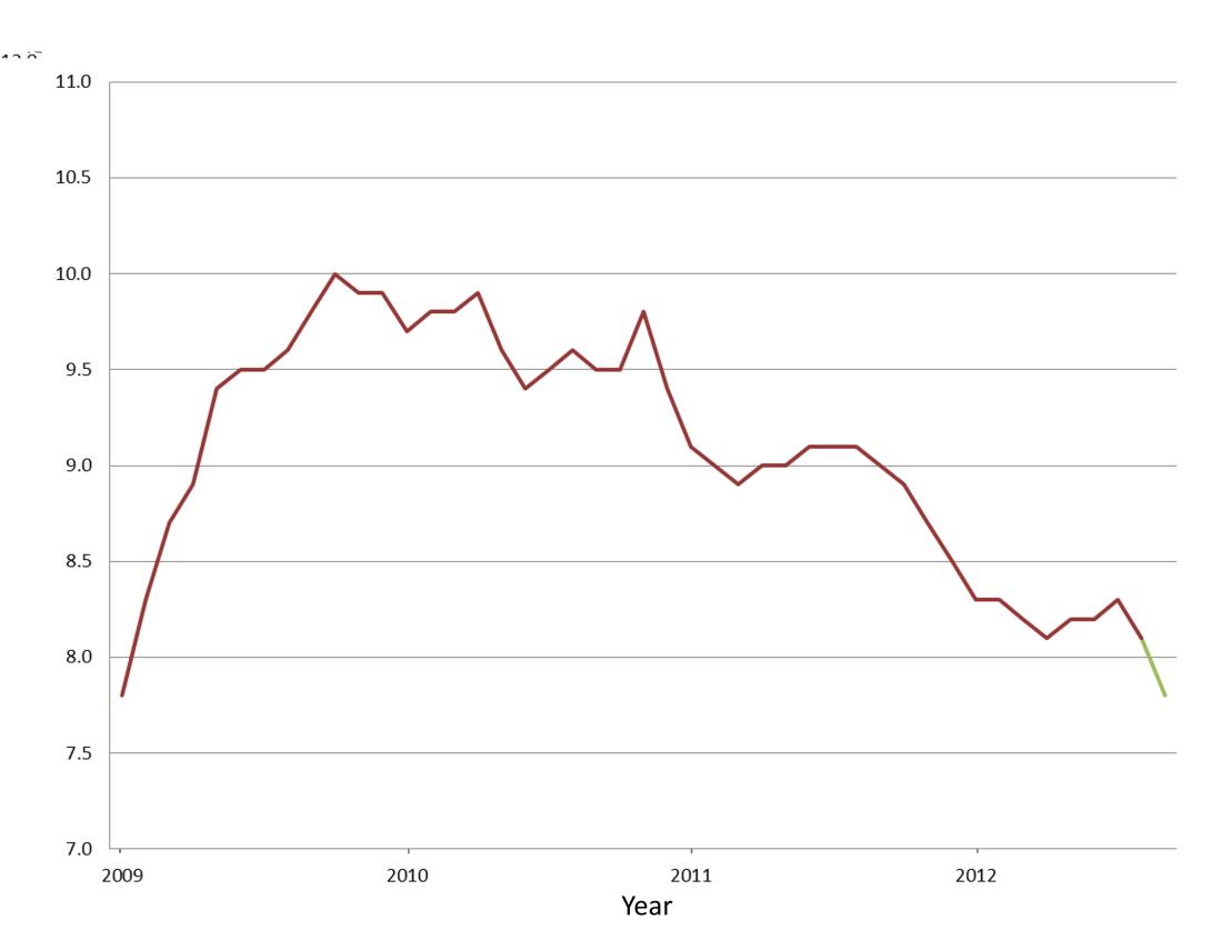
That green part on the line is what everyone is now obsessing over. That’s the massive left-wing conspiracy. In reality, September’s unemployment numbers are unremarkable. Symbolic, yes, but otherwise nothing to get riled-up about. Last month’s numbers are indicative of a long-term trend. One would be right to notice, however, that the trend is very gradual…too gradual for anyone’s comfort. Let’s take a step back and look at the really big picture, say the last 32 years…
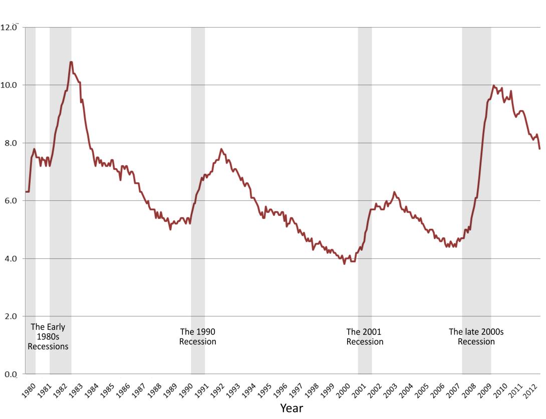
Why 32-years you ask? It will help put the most recent economic downturn and today’s recovery in perspective and will capture what has happened in the previous four recessions (and 1980 is a nice round number). As you can see, what we now call the “Great Recession” of 2008-2009 was a dramatic blow to the nation’s economy. But if we look at unemployment rates alone, we see that the Great Recession is not unique in this respect. The recessions of the early 1980s, which saw similar increases in the unemployed, are often points of comparison among economists for today’s economic struggles (there are reasons why the latest recession was much, much worse than that of the early 1980s, for reasons besides unemployment rates… but I’ll save that for another blog post). Unlike today however, the recovery during the mid 80s was much more quick, much to the delight of Ronald Reagan who was seeking re-election at the time. Today’s employment recovery, rather, looks more like the slower pace seen after the much smaller recessions in the early 90s and 2000s. Despite its slowness, however, it is definitely a steady decline. All of the dips and bumps seen in the month to month numbers seem to make more sense from this perspective. The 0.1 or 0.3 point increases and decreases in a month’s time don’t really capture what is going on.
And now the latest poverty numbers…
Every fall, the major media outlets in this country suddenly focus on the plight of low-income Americans as news reporters write stories on the latest poverty numbers from the U.S. Census Bureau. Here too, however, these stories either fixate on one number (or how it compares to last year’s number), or fail to explain what the poverty rate means in a larger economic context. Let’s go through the same exercise:
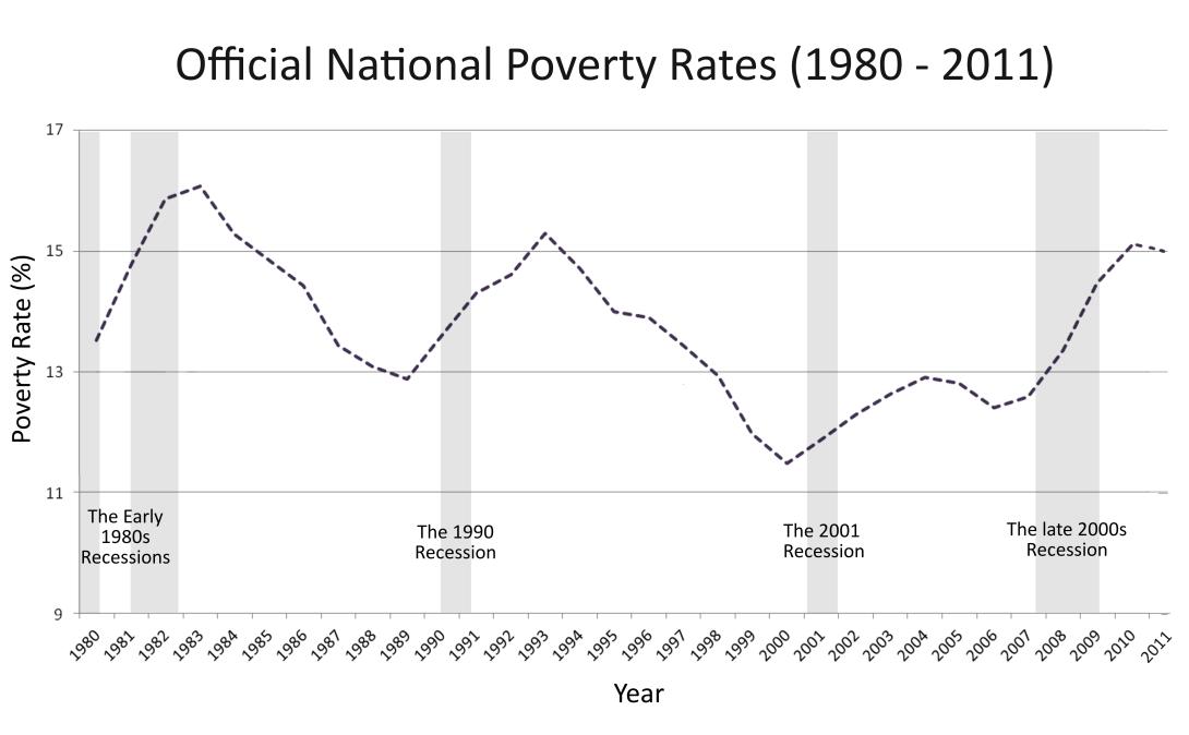
Like unemployment rates, poverty rates follow the same boom and bust pattern. However, poverty is a lagging indicator compared to unemployment. Over the past 32 years we have typically seen increases in poverty rates years after recessions have officially ended and after employment starts to go back up. Only after a couple years do we see poverty rates go back down during a recovery. Some think the just-released 2011 poverty rate (15.0% compared to 15.1% from 2010) is a sign that poverty has finally leveled off and will start going back down. Hopefully this is true, but just as one month’s number doesn’t make a trend, one year’s number doesn’t either. Many think that the stubbornly high number of people out of labor force will also keep poverty rates high for a while longer.
Another way we can put poverty and unemployment statistics into context is to look at the variation in these trends across the country. Vermont is not the same as Mississippi, and just looking at poverty or unemployment at the national level masks tremendous differences in how states and localities are faring economically. One can see this comparing pre-recession poverty rates among the states to today’s rates. The table below shows the various poverty rates in 2005 (when poverty rates where at some of their lowest in the last decade) and in 2011, along with their rankings compared to other states:
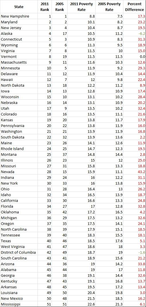
Alaska and Nevada are illustrative of the extremely different trajectories states took during the economic downturn. Alaska’s poverty rate was one of the few that actually improved, while Nevada saw some of the steepest increases. The Great Recession did not affect the states in the same manner or degree, and poverty rates really show this.
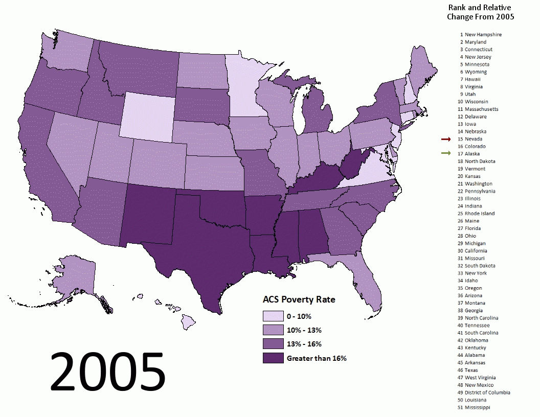
If you think Alaska is a misleading outlier, then look at poverty rates in Vermont or Montana pre- and post-recession and you get a similar picture of this disparity. During the last few years most of the state trends saw rising poverty rates, but these trends were either steeper or more gradual depending on the state. In other words, while it may be true that the national poverty rate may finally be leveling off or declining, some states will surely still see increases or not see declines for some time.
(For a similar look at unemployment among the states see our previous post Job Gains and Losses, 2007 – 2012)


