Job Gains and Losses, 2007-2012
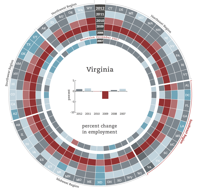
The Pew Center on the States recently published an interactive graphic on job gains and losses among the states. Using Bureau of Labor Statistics data, they examine annual percent changes (April to April) in the number of employed persons in each state between 2007 and 2012.

This interactive graphic is conceptually very similar to the state-by-state infographic on gay rights. There are six concentric circles, each representing one year. For example, 2007 captures the percent change in employment between April 2006 and 2007. A white band represents the official beginning of the recession in December 2007. The states are organized into five regions, although the separation between the regions is not well defined.

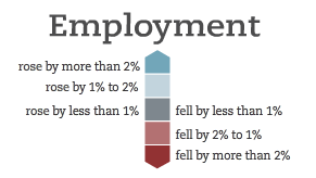
Each color on the graph corresponds to a change in the number of employed persons within the state. Red indicates employment loss, the gray indicates negligible change (plus or minus 1%), and the blue indicates employment growth. Selecting a state with your mouse will bring up a bar graph within the center of the circle with the actual year-to-year percent change in employment of the selected state.
I found this graphic quite helpful for visualizing the general experience of the past few years.
- Nearly all states saw large losses in employment between April 2008 and April 2009, the year immediately following the official onset of the recession.
- Most states slowed their rate of job loss between 2009 and 2010 (gray color blocks for 2010), although the Southwest region continued to be hard hit by job loss, with Arizona and Nevada hardest hit.
- The jobs situation has begun to improve somewhat, although changes have been small in many states. The Southwest region is again an exception, with many states showing light or dark blue cells for 2012, indicating growth between 2011 and 2012. These states, however, also suffered the largest losses in earlier years and thus have more jobs to regain.
Scrolling around the circle shows that state experiences varied widely. Nevada, for example, experienced substantial employment losses between 2008 and 2009, nearly 10%, followed by another sizable loss in 2010 and negligible growth in subsequent years. In contrast, the post-recession year was only a minor setback for North Dakota, which continued to grow, and increase its rate of job growth, between 2009 and 2012. A closer look at Virginia shows that our state, like the vast majority of states, experienced employment loss between 2008 and 2009 but has had small gains in recent years.
The Pew Center on the States provided a novel look at much talked about data with this graphic. When contextualized with other information on unemployment by state, this provides a helpful way to understand how the experience of the recession was both similar and different across states.


