The long distance runner: Lonely, no more?
Recently, Hamilton shared a great post about American ancestry. The first sentence of his post– “This is one of my favorite demographic maps.”— made me wonder: Have I ever said those words? Do I have a favorite demographic map?
There are plenty of maps that I appreciate for what they reveal, such as one from this past summer painting a stark picture of US income mobility. Some maps are more for fun: though I wish I had a better handle on the source, I definitely got a kick out of the map revealing the concentration of red-heads in Europe that made the rounds last year. And, of course, the Racial Dot Map was pretty great for both substance and style (though I personally think that the Congressional Dot Map was even more interesting).
This week, though, I happened across a great new map that I appreciate not only for its visual appeal and powerful presentation of data, but also because it provides great information on a topic I care a lot about: running.

Strava allows runners and cyclists to automatically sync training data from their smart phones or GPS watches to an online account. It is a free way to keep an accurate record of how far and fast you’ve run (or biked), and other data besides. A membership to the company’s paid service provides additional functions, like a comparison of how you stack up against others running locally.
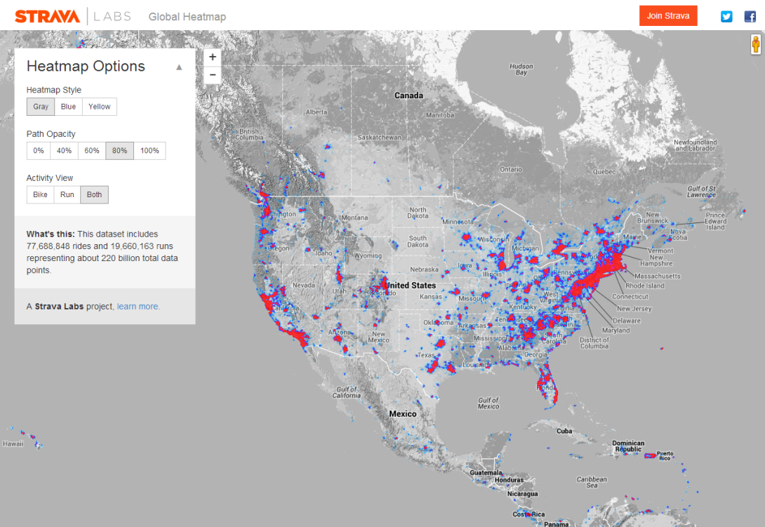
Strava Labs uses this information in a variety of data visualization projects, including this heatmap showing the routes Strava users commonly take on their jaunts (don’t worry, there’s a well-stated privacy policy in place). According to Strava Labs, the data set from which they generated the heatmap includes information from 77,688,848 rides and 19,660,163 runs. In the color scheme here, red indicates heavily traveled routes, while dark blue gives moderately traveled ones, and light blue, the ones with the least traffic of all.
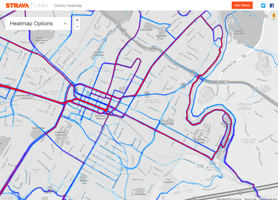
As a runner from Charlottesville, I found the local map of Strava users’ running routes not too surprising– these red lines are full of runners at nearly any time of day.

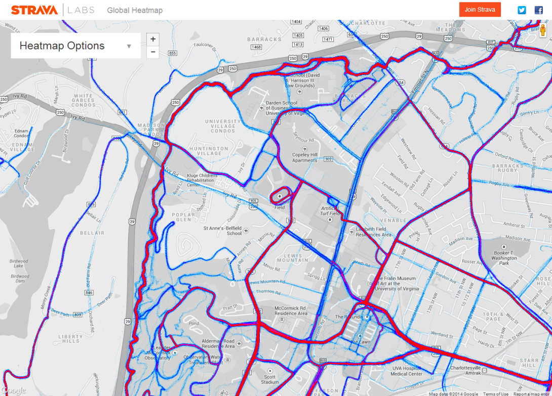
I can use this to see how well-trod the various popular routes around here are–and so can people who don’t live here, but are simply visiting and looking to lace up and head out in a new place. It also helps to display some of the off-road options around here, information that’s not always obvious to track down. And for those looking for a track to get in a speed workout, it certainly is easy to spot that telltale shape:

However, it’s pretty hilly around Mr. Jefferson’s University, and the map loses topographic information at high zoom levels, so it’s difficult to appreciate just how difficult some climbs can be.
Even so, this definitely strikes me as a great tool for finding runs or rides when traveling to new places, a beautiful worldwide display of human activity*, and a great way to turn a huge data set into an easy-to-understand visual for some of the most numbers-obsessed athletes out there.
___________________
*At least among Strava users.


