Visualizing the nation’s future population
The Cooper Center recently released population projections through the year 2040 for all 50 states and the District of Columbia. In addition to detailing information about projected changes to the size of the national and state populations over the next couple of decades, the data release also breaks down projected populations by age group and sex and provides information about median population age. The interactive tool below was designed to help users visualize this information.
Read on for a few examples of how you can use the tool to visualize some of the key demographic trends reflected in the projections.
1. The nation’s population is projected to age
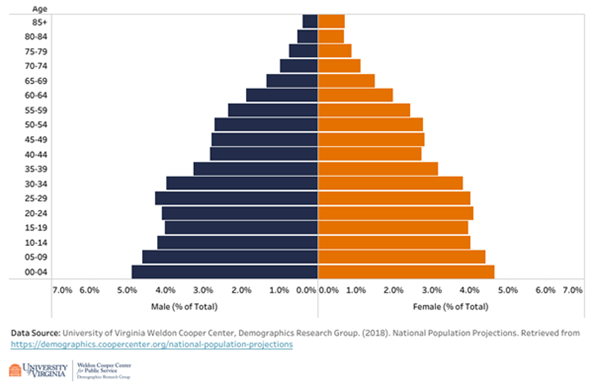
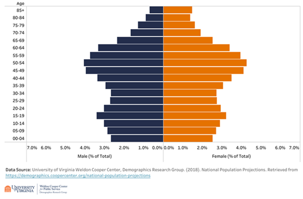
Utah and Maine serve as good examples of how population age structure can be envisioned using population pyramids since these two states represent the two extremes of age structure among all states. In 2010, the median age of Utah’s population was 29.2 years, making it the youngest in the nation, while Maine’s population was the oldest, with a median age of 42.7 years. As can be seen in Figures 1A and 2A below, Utah’s 2010 population pyramid has a broader base, with a greater proportion of its population being concentrated in the youngest age groups at the bottom of the pyramid. In contrast, Maine’s 2010 population pyramid is more top-heavy in shape as a result of the heavier concentration of its population in older age groups towards the top of the pyramid.
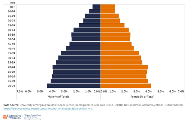
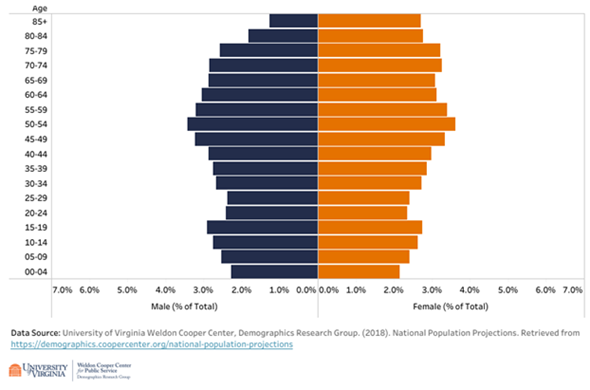
Even though Utah and Maine are projected to continue to be the youngest and oldest states in the nation in 2040, respectively, the populations of both states are projected to age. The proportion of Utah’s population age 65 years and older is expected to increase from 9 percent in 2010 to 14 percent in 2040, while in Maine, the 65+ age group is projected to expand from 16 percent of the population in 2010 to 27 percent in 2040. You can quickly spot this population aging effect visually in each state’s population pyramid with the expansion of the width of the bars at the top of the pyramid over time. (See Figures 1B and 2B below).
| Figure 1A. Utah 2010 Age Structure | Figure 2A. Maine 2010 Age Structure |
Image
| Image
|
| Figure 1B. Utah 2040 Age Structure | Figure 2B. Maine 2040 Age Structure |
Image
| Image
|
2. The nation’s population is projected to become more female
Another demographic trend that the Utah and Maine population pyramids illustrate is the feminization of populations as they age. As this blog post explains, women generally outnumber men in the older age groups due to longer female life expectancy. As large numbers of female Baby Boomers pour into the older age groups over the next couple of decades and outlive their male counterparts, the percentage of females in the U.S. population overall is projected to increase. This trend is represented visually in the population pyramids by longer bars on the right (female) side of the pyramid among the older age groups. The projected male/female imbalance is especially noticeable in Maine’s 2040 population pyramid (Figure 2B above).
Largely because of its younger age structure, Utah was one of only eight states in 2010 to have a lower percentage of females than males in its population (49.8%). (Alaska, Colorado, Hawaii, Montana, Nevada, North Dakota, and Wyoming were the others.) By 2040, however, as Utah’s population ages along with the rest of the United States, the gender balance in Utah is expected to tip in favor of females. Every other state in the nation is also projected to experience an increase in the proportion of females within its population by 2040, except the District of Columbia.
3. Population growth rates are expected to be the highest in the western and southern regions
The “Regional Population Change” tab in the tool illustrates the higher projected growth rates through 2040 for the nation’s western and southern regions. As shown in Figure 3 below, while the West South Central, Mountain, South Atlantic, and Pacific regions (census divisions) are all projected to experience greater than 25 percent population growth from 2010 to 2040, the other regions in the United States are each expected to grow by less than 15 percent.
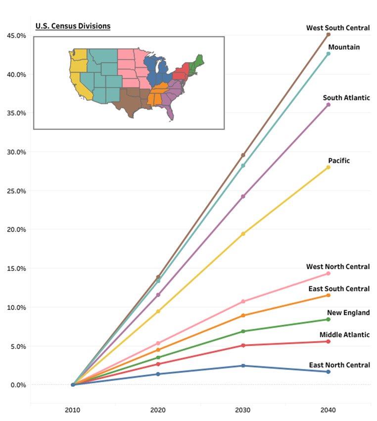
These regional population growth patterns help explain the gradual shift of the mean center of U.S. population to the west and south over the course of the nation’s history, as Figure 4 below illustrates.
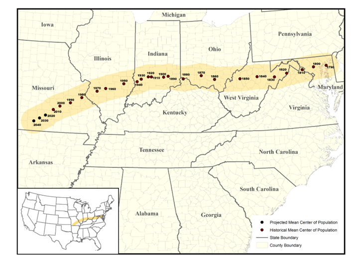
Image source: University of Virginia Weldon Cooper Center, Demographics Research Group. (2018). National Population Projections. Retrieved from https://coopercenter.org/national-population-projections


