The U.S. Didn’t Win the Olympics After All
One thing we heard a lot throughout the Olympics coverage was the medal count. At the end of every day, NBC would flash up its graphic and Bob Costas would tell us that the U.S. or China was in the lead. Every time that happened, my demographer hackles were raised.
Turns out, reporting on Olympics medal statistics is a lot like reporting on Virginia statistics. If the VA media chose to report just raw numbers as measures of success, they would pretty much always conclude that areas of Northern Virginia are doing the best. Those areas have more educated people, more professional workers, more people moving in, etc, but a lot of those statistics are just driven by an underlying population that is much larger than that of localities in other parts of the Commonwealth. Reporting just the total medal count in the Olympics makes it look like the U.S. and China are the most successful at the Games. But are they really?
Whenever NBC flashed up the medal count graphic, I wished they would look at the numbers in other ways too. Why don’t they tell us about the countries with the largest percentages of athletes winning medals? Why don’t they tell us how the medal count relates to the country’s total population? It turns out that while NBC wasn’t reporting the numbers the way I wanted them to, The Guardian was doing so on their DataBlog. In fact, the folks at DataBlog teamed up with other statisticians and did a pretty in depth analysis of the Olympics data. Their conclusion… Russia was the winner of the Olympic games. To come up with this conclusion they examined the number of medals won by each country on the basis of the country’s population and the GDP per capita. Anagnostopoulos, one of the data analysts, stated “we propose this as a purer measure of athletic skill.” Their final rankings for the 2012 Olympics are:

1. Russia
2. UK
3. China
4. Hungary
5. South Korea
6. Ukraine
7. Australia
8. Cuba
9. Jamaica
10. Belarus
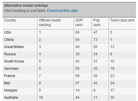
The U.S. doesn’t even appear in the top 10 using this mechanism for measuring Olympics success! However, this isn’t the only way to look at the medal count. Garry Blight and Simon Rogers put together an interactive table where you can view the medal count based on separate indicators: country population, GDP, and Olympics team size. Turns out, based on these alternative measures too, the U.S. didn’t run away with it.
While officially the U.S. earned more medals than any other country, the U.S. ranked 66th in medals earned in terms of GDP, 47th in medals earned in terms of country population, and 5th in medals earned in terms of team size (in this analysis they did weight gold medals more heavily than silver, and silver more heavily than bronze).

I’m still not completely satisfied with these results, so I took advantage of The Guardian’s offer to download the data and run my own analysis. One thing I’m not crazy about in the analyses I’ve seen around the web is that countries are given credit for just one medal in team sports. While counting each soccer player’s medal could skew a direct medal count (one win would appear as 18 medals because there are 18 the players on the roster), I think it’s important to count them all when we’re looking at a medal count in the context of a statistic like country population or team size. I found out that the data from The Guardian aren’t perfect, and a lot of the medals were missing for members of winning teams, so I edited as best I could, ensuring that at least the medal earners in sports with large teams (basketball, handball, field hockey, soccer, volleyball, and water polo) were credited for the medals they earned. Here is what I found when I compared the official medal count to my medal count, accounting for team size:
| Country | Medal Ranking by Team Size | Medal ranking by team size including all team medals |
| China | 1 | 3 |
| Jamaica | 2 | 6 |
| Iran | 3 | 14 |
| Botswana | 4 | 1 |
| US | 5 | 2 |
| Ethiopia | 6 | 23 |
| Kenya | 7 | 18 |
| Russia | 8 | 15 |
| Grenada | 9 | 27 |
| Georgia | 10 | 35 |
My change did make quite a difference in the rankings. My guess is this finding is mostly stemming from the nature of the team sports and the countries in which they are popular, but it was fun to look at the data in a different way nonetheless.
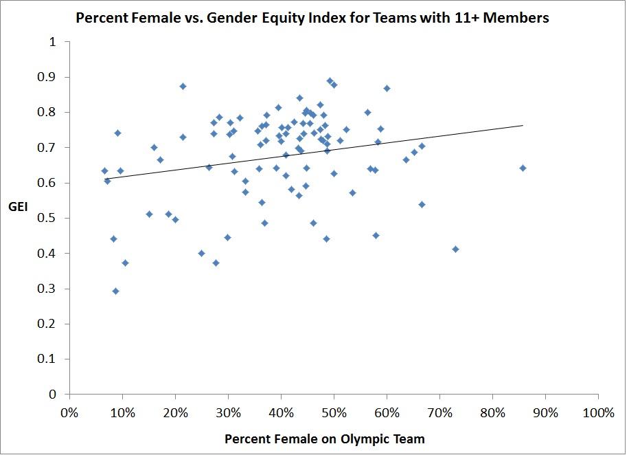
There’s also been a lot of buzz this week about how well the U.S. women did at the Olympics. I thought it would be interesting to look at women’s representation on the Olympic teams and how that correlated with women’s rights rankings. Using the 2012 Gender Equity Index, published by Social Watch, as my metric for women’s rights throughout the world, I plotted the percent of each country’s team that was female against the Gender Equity Index for that country. There is no Gender Equity Index ranking for many of the countries represented at the Olympics, including mostly small island nations, but also some large countries like Tunisia, North Korea, Nigeria, Taiwan, and Hong Kong. I also had to drop countries with really small team sizes to get reliable female proportions. In the end, the plot looks like this for the 94 countries where a Gender Equity Index exists and the Olympic team had at least 11 members:

Female representation on the Olympic teams is on the x-axis and the Gender Equity Index is on the y-axis. Larger values of the Gender Equity Index represent higher gender equality in that country. This plot (along with a regression analysis I ran separately) shows that the Gender Equity Index is a significant predictor of female representation. Countries with more gender equality are likely to have a higher proportion of females on their Olympic team.
My exploration into alternative measures of success was fun and interesting, and I got to learn some new things. I was pleased to see that, although not a part of NBC’s primetime coverage, there are a lot of people out there exploring this data in meaningful ways. Looking more deeply into the numbers is an important exercise whether we’re looking at fun data about the world’s greatest athletes or data with more important implications, like those that tell us how Virginia’s residents are faring.


