A map that shows what’s wrong with Washington
The recent government shutdown and flirtation with default has seriously deteriorated public trust in Congress, and in Washington more generally. Disgust with Washington is often followed by bewilderment. How did things get this way?
While there is no single answer to this question, if I had to choose one, it would be current redistricting practices. There is a strong case to be made that political polarization (and associated intransigence and brinkmanship) are rooted in gerrymandered congressional districts.
Gerrymandering, the art and science of lawmakers choosing their own voters rather than the other way around, has ensured that most representatives in the U.S. House are safe from general election challenges. Without those challenges, positions taken by elected officials are not exposed to debate and to the typically moderating effect of contested elections. In contrast, in gerrymandered districts where it is clear that one party or the other has a more or less certain general election victory in hand, candidates from the opposing party opt out of running (or have little real chance of winning if they do). As a result, the only threats to these lawmakers come in contentious primary contests from the hard left and hard right. Being “primaried” is now a common term among political strategists, and is often used to describe well-financed tea party challengers who unseat moderate Republicans. As moderation, from either side, is lost in primary challenges, the result is more rigidly ideological victors and the deadlock we see with increasing frequency in Congress.
Having helped with drawing redistricting maps for Virginia’s advisory bipartisan commission during the last cycle, I have a very good handle on how the process of redistricting works. If you want to be nefarious and construct the perfect gerrymandered district this is what you’ll need:
1. Census data on total population. One of the major constraints map drawers have in redistricting is the “one person, one vote” standard mandated by the U.S. Constitution. All congressional districts within a state must have essentially the same total population, around 710,000 people.
2. Race and ethnicity data from the census. One the primary reasons we collect race information during the decennial census is to enforce the Voting Rights Act during the redistricting process so that minority groups have a reasonable chance of electing a candidate of their choosing. Race is also used by political gerrymanderers as a proxy for political affiliation…useful data if you want to pick and choose what kind of voters you want in a district.
3. Past election data. If you are drawing districts to protect incumbents or to give your political party the advantage, past election results by precinct are crucial. You want to efficiently distribute the voters you like across districts in order to maximize your number of seats in congress or the state legislature.
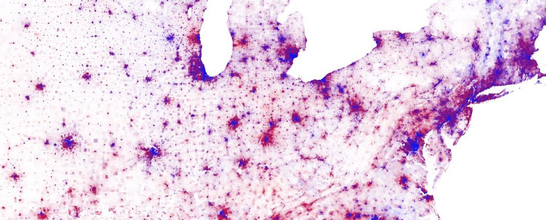
Jonathan Rodden from the Spatial Social Science Lab at Stanford has kindly provided data from the 2008 presidential election for every voting precinct in the country (minus Oregon), taking care of #3. Red dots are Republican votes, blue dots are Democratic votes.

Finally, I have overlaid the current congressional district boundaries from the TIGER/Line Shapefile project at the Census Bureau.
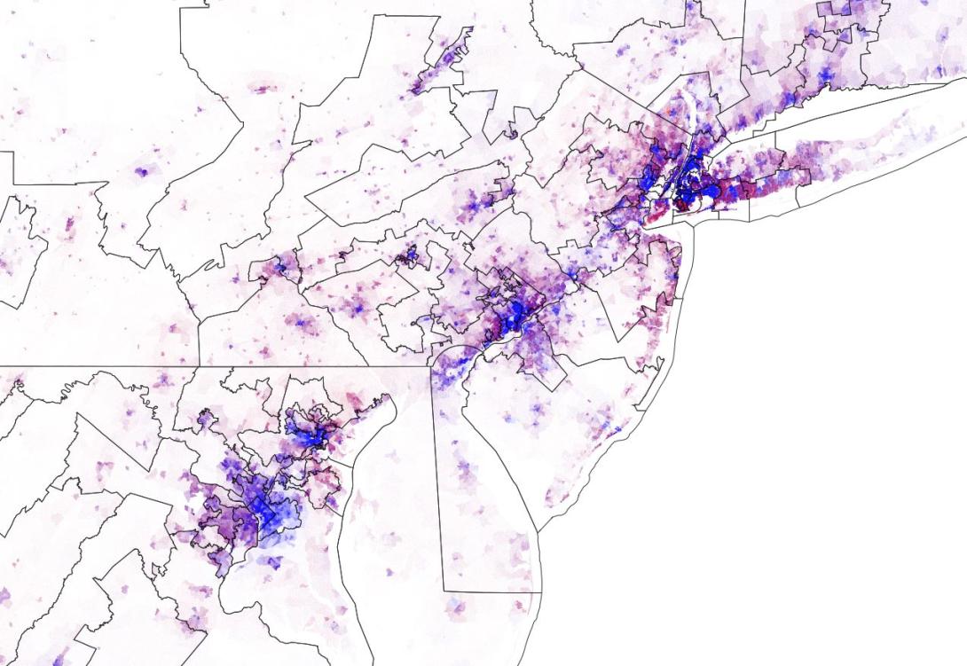
The results are, at turns, mesmerizing and depressing. Take, for example, some of the country’s “Ugliest Districts” as named and described by Roll Call:
North Carolina’s 4th Congressional District: “The Hanging Claw”
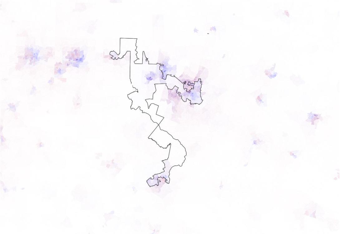
“Tar Heel Republicans packed all the Democrats they could into this district. It’s just one controversial part of an aggressive redraw intended to oust four House Democrats next year. But the 4th district is the worst formation on the new map, appearing more like an archipelago than a contiguous land mass. Republicans packed most of the Research Triangle into the district, including the liberal university towns of Chapel Hill and Raleigh. Given the area’s famous athletic programs, one Democrat griped that you could kick a field goal over the 40-yard width of the district at one dimension.”
Maryland’s 3rd District: “The Pinwheel of Death”
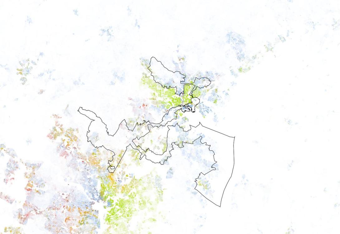
“It’s hard to believe Rep. John Sarbanes’ (D) district could get much worse than its present form. But Democrats drew a doozy for Sarbanes by moving parts of Montgomery County into the 3rd district. The district immediately drew comparisons to a Rorschach test for its splotchy shape. One local reporter said it took him nine hours to drive from end to end. So what’s the goal behind giving Sarbanes a district shaped like an amusement park ride? Sources speculate he wants to lay the groundwork for a Senate bid someday, and the pinwheel shape puts him in nearly all of the state’s key media markets.”
Michigan’s 14th District: “The 8 Mile Mess”
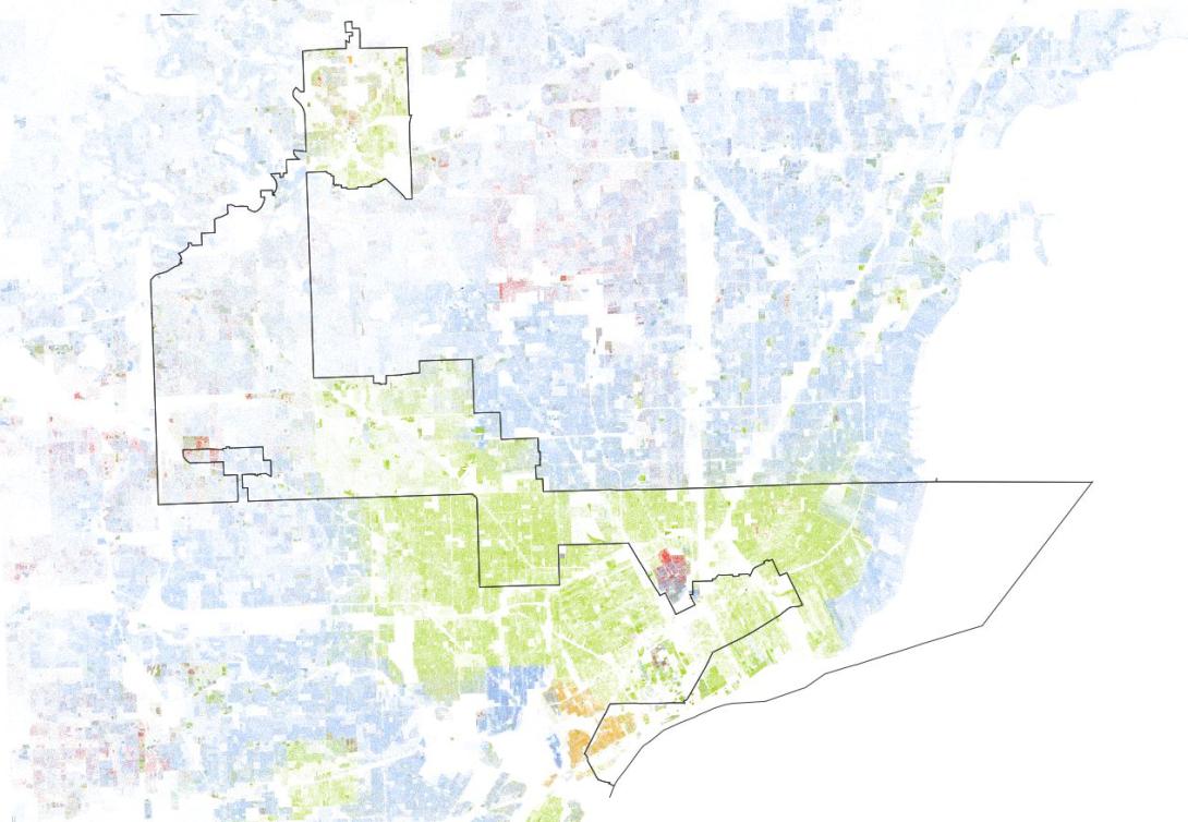
“Republicans went to great lengths to pack as many minority and Democratic voters into this downtown Detroit district…The result is a winding, economically diverse district that follows the city’s famous 8 Mile Road. The road serves as a symbolic divide between urban blight and the affluent suburbs. The new 14th aims to bridge that divide, starting in the wealthy Grosse Pointe suburbs on the lake and moving west and north to blue-collar Pontiac City…Now that’s some creative mapmaking.”
Illinois’ 4th District: “The Latin Earmuffs”
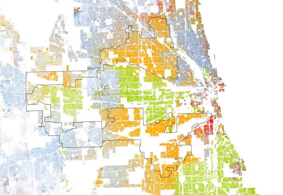
“Democrats packed as many Hispanic voters as possible into Rep. Luis Gutierrez’s (D) redrawn seat. They created a supermajority Hispanic district that has attracted considerable unfavorable attention, both among the delegation and in court. A GOP lawsuit claims this district is illegal because there are enough Hispanic voters in the state for two majority-minority districts. Three black Democrats in the delegation expressed similar concerns. Down the line, this district will only get more interesting. Hispanics make up the fastest-growing ethnic community in the Chicago area.”
There are numerous examples, beyond the ones above, where political considerations determined the shape of districts. Be sure to take a few minutes and look up your own district.
Important Note:
The 2008 Election dot map is based on voting precincts, which are a much larger geographic unit then census blocks, which form the basis for the Racial Dot Map. Because of this difference, the dots representing votes will often appear more dispersed than the dots representing racial identity. Those who draw district lines often supplement election data with other micro-targeting databases (like magazine subscription data or donor information) to improve the geographic resolution of information on political affiliation.


