Demographics and Infographics
I read quite a few blogs about demographics and statistics. One of my favorites is FlowingData, which is written by Nathan Yau, a PhD candidate in statistics at UCLA. He focuses mainly on how researchers use data visualization to convey their results to non-experts. Nathan recently posted links to two really neat infographics.
1) Pay gap between men and women – this tool plots the weekly median salary for women vs. the weekly median salary for men. You can scroll through the displayed year and watch how the data changed from 2003 through 2011. You can turn occupation groups on and off and click on the dots to see the more detailed occupation and where exactly it falls on the graph. Over the nine year period, there were only a handful of computers and mathematics, professional, and sales and office occupations for which the median salaries for women went briefly and slightly above the median salaries for men.
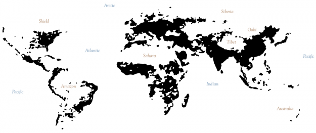
2) Population densities around the world – this interactive map was developed by Derek Watkins, a graduate student in Geography at the University of Oregon. He calls the map “a squinty-eyed look at population densities.” Users can move the slider to display areas with population densities of 5 – 500 people per square kilometer. The underlying data come from the Gridded Population of the World project at Columbia University.

This image is a screen capture of the map showing areas of the world with at least 15 people per square kilometer. Nathan Yau added the labels for reference. On the interactive map, it’s interesting to scroll and see how dense India and China are compared with the rest of the world.
I highly recommend following the FlowingData blog; it’s a fun read. Nathan finds and shares a lot of great data visualization tools on a variety of topics.


