


The post-recession shape of American cities
Since the Changing Shape of American Cities report came out, I’ve fielded numerous questions about whether the trends cited had much to do with the subprime mortgage crisis and the recession that followed. The short answer is no. The recession may have accelerated things, but the shift began long before 2006. Data from 2000 shows a steady march from the 1990 “old donut” to the 2012 “new donut.”
But with the release of the new 2011-2015 American Community Survey 5-year estimates, we have a chance to see a true post-recession data point, a full 3 years newer than the data used in the report. I’ve crunched those numbers and added them to the charting tool here.
For the most part, the new data shows no dramatic changes (unsurprising since the two 5-year estimates overlap by two years and thus are drawing on some of the same data). Where there has been change, it’s largely been a continuation of the trends noted in the paper. The most consistent trend is a slight increase in per-capita income in the center, visible on the composite map and present in most of the cities that experienced any visible change. A few cities that continued to experience transition over that three year-period include:
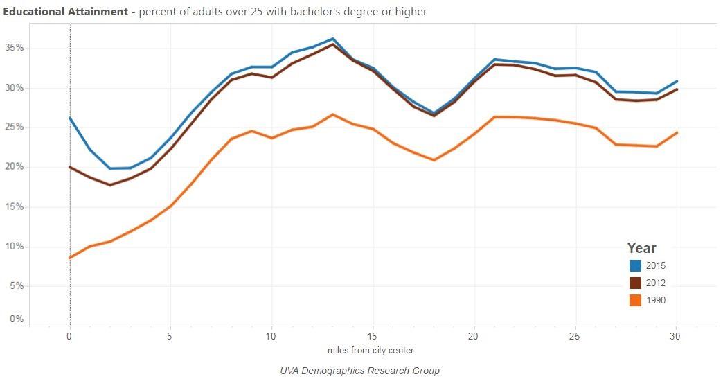
Los Angeles, CA
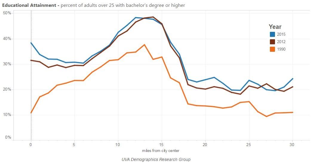
Richmond, VA
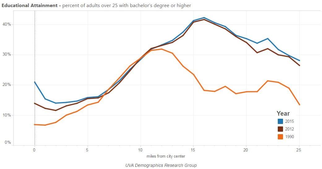
San Antonio, TX
What stands out to me is that many of the most established cities, with the most visible new donuts already, also saw the least change. Many of the cities that looked like they had changed the least before are now starting to show signs of moving in the new donut direction. It may be that there is a natural asymptote for the cities at the forefront of the trend, while other cities are just a few years behind and are now playing catch-up.
Take a look for yourself and see if you see any other patterns.