


More on Virginia’s Colleges
Speaking of infographics, I’ve been playing with the college completion data I highlighted previously. Below is a star chart (aka radar chart, spider chart) of data on Virginia’s 4-year public colleges.
Each spoke represents a different piece of data, and the length of the spoke conveys the magnitude of that data for each university. The colleges themselves are ordered by the number of students which you can see in the spoke pointing due East – that spoke is longest for Virginia Tech and shortest for Virginia Military Institute.
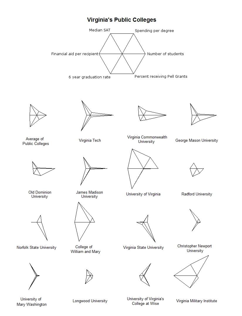
So, for instance, Virginia Tech ranks high on the number of students, the 6-year graduation rate, and the median SAT of students (these spokes are all relatively long), and ranks low on the percent of students receiving Pell Grants (a measure of economic diversity, or the proportion of low-income undergrads on campus), the amount of financial aid per student receiving aid, and the amount spent for each degree awarded; JMU has a similar pattern.
Meanwhile, UVa ranks pretty high on each dimension, except the percent of students with Pell Grants; the institution that most closely resembles UVa, by these measures, is William and Mary, but with fewer students and with less spent per degree.
Other differences jump out as well. Norfolk State University and Virginia State University are serving the biggest proportions of low-income students. VMI spends, far and away, more per degree awarded than the other public institutions. You get the idea.
I could have seen all of this information about the colleges in the original data tables, of course, but the ability to visually compare across a range of dimensions all at once is more illuminating (and, honestly, more fun!).