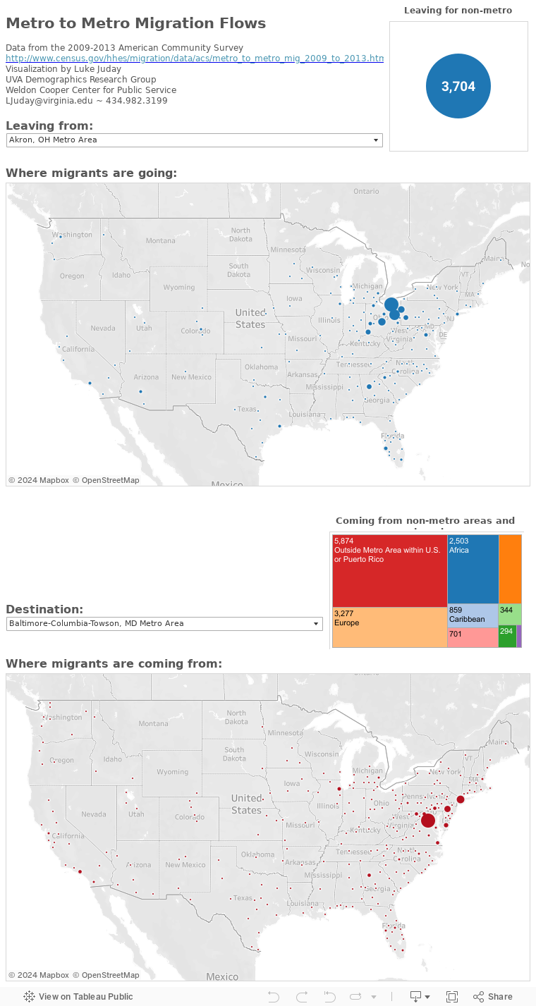


Mapping city to city migration
The Census Bureau recently released new migration data based on the 2009-2013 5-year American Community Survey estimates. This data estimates how many people move between each of the country’s metropolitan areas over the course of a year.
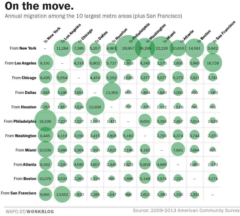
There are plenty of interesting things that can be teased out of this data, but flow data is always a little bulky to play with. The Washington Post’s Wonkblog put up a great chart showing migration between the country’s largest metro areas:
For those of us interested in metro areas outside the top 11, I put together these interactive maps. On the first map, you can choose a metro area and see where out-migrants are leaving to go. On the second, you can see where in-migrants are coming from. Mouse over the circles to see numbers.