Innovative Data Use and Social Problem Solving
As a data consumer and user, I am constantly amazed at the pure volume of data currently available, as well as the many analytical tools that enable us to better understand this data and the technology that makes it all readily accessible and shareable. Data can be just numbers on a page, buried in a dry table in the back of some compendium of facts and figures, but when given the appropriate context and made relevant to users it helps us better understand the world around us.

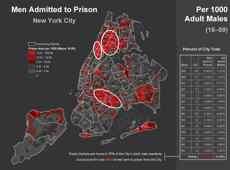
Police departments often use mapping technology to identify high crime neighborhoods or areas that may need more policing. In an innovative twist, the Justice Mapping Center maps the addresses of every prison inmate, producing maps that detail the neighborhood effects of incarceration. “Million Dollar Blocks” are areas within New York City where the state and the city are spending, each year, more than $1 million to send people to prison. While many of the results are not surprising, taking this data from the typical context—a table or a bar chart—and putting it on a map enables policy makers and public officials to see old problems in a new light:
“…when you actually gather the real data…on maps, [it becomes] immediately understandable to people who didn’t see it – like legislators, city council people, researchers….One of the things we noticed right away when legislators and others started to see this, is they talked about this issue differently. Instead of getting stuck in the ‘being soft, get tough [on crime]’ paradox, they started to talk about neighborhoods.” – Eric Cadora, director of the Justice Mapping Center (NPR interview)
As a result of this research, new approaches to prisoner re-entry and parolee management are being implemented across the country. Money typically spent on incarceration can instead be spent on strengthening neighborhoods and their surrounding communities, ultimately creating better economic well-being for individuals, their families, and the neighborhood, and reducing long-term costs for the city and state. While it is too early to see the overall effects of these programs on recidivism rates, the Justice Mapping Center also uses maps to help cities and states identify easy ways to cut costs in parolee and probationer administration programs.

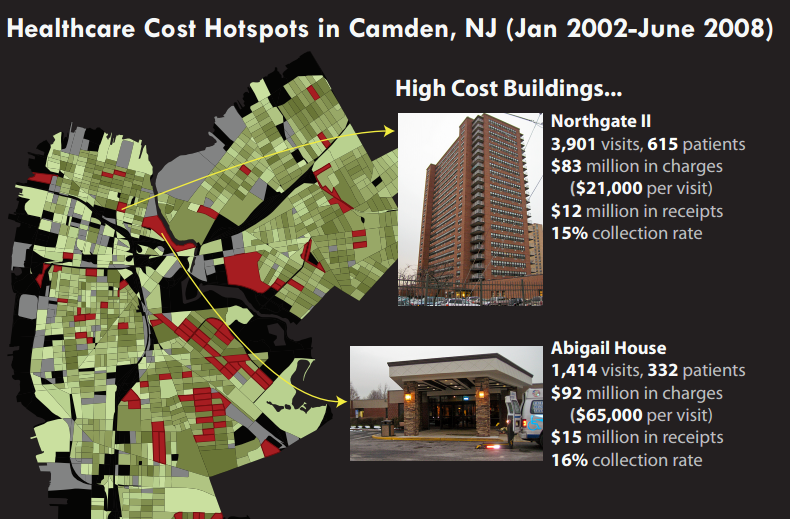
Similar analysis on an entirely different problem—escalating health care costs—has yielded innovative solutions in Camden, New Jersey. Mapping medical “hot spots,” areas within Camden with high levels of ambulance use and high health costs per resident, physician Jeffrey Brenner, founder of the Camden Coalition of Health Care Providers, found that many individuals receiving the most expensive treatments were also receiving the worst care. In fact, they found that 80% of medical costs were incurred by only 13% of the patients. By identifying health system “super-utilizer” individuals and neighborhoods and creating targeted interventions that focused on high quality, lower cost preventative care, the Camden Coalition improved medical care while lowering overall costs.
In both of these situations, looking at data from a new perspective brought people together to create previously unimagined solutions to social problems.


