A funny thing is happening in many US cities
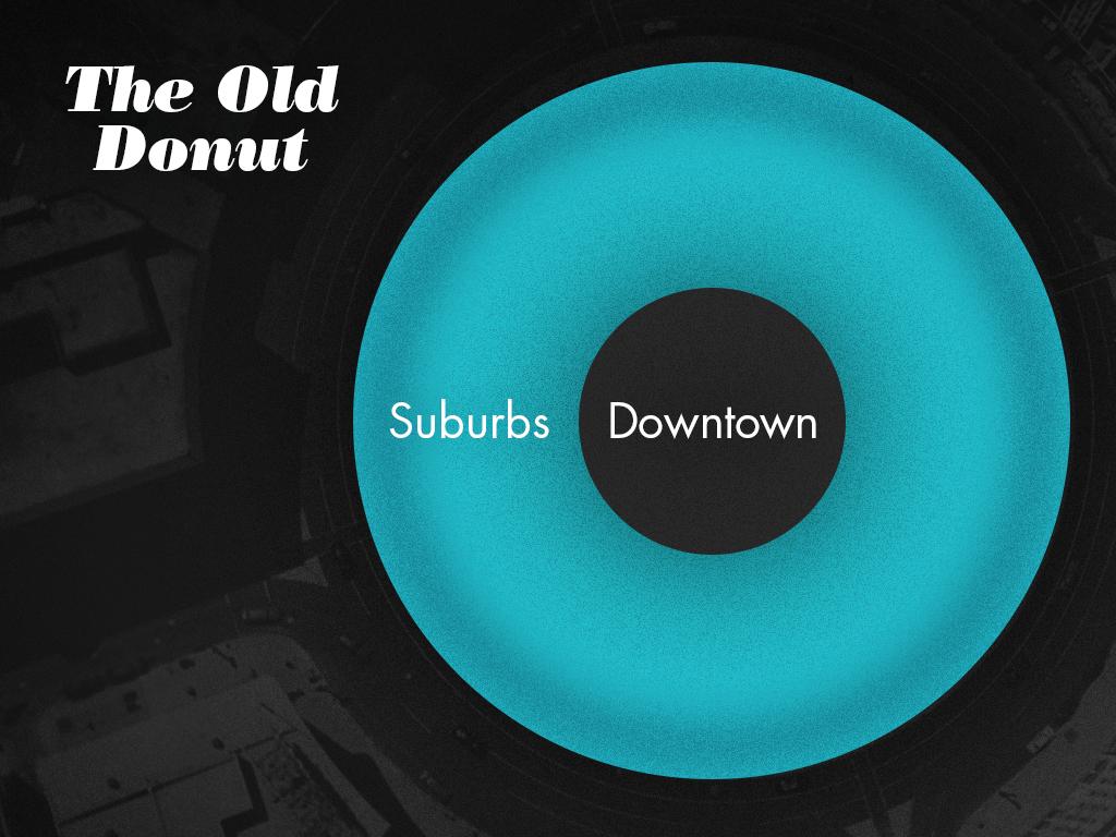
An article at the Urbanophile gives us a helpful graphic explaining the old and new “Donut” conceptions of the city. In the “Old Donut,” we have an impoverished central city with a ring of thriving suburbs around it.
An example of that model appears in this graph, which shows the percentage of adults over 25 with college degrees in the Charlotte, NC metro area in 1990. The x-axis is distance from the center of downtown.
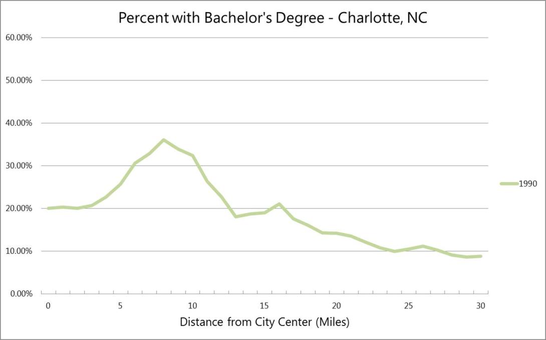
There is a clear “hump” pattern. Low rates of education and income (the income graph looks very similar) in the center of the city give way to high rates of education and income in the suburbs, falling to lower rural rates beyond. This makes sense in the “Old Donut” model of the city. In the 20-odd years since 1990, more Americans have earned bachelor’s degrees overall and the city has expanded in size. But something else changed in Charlotte during that time:
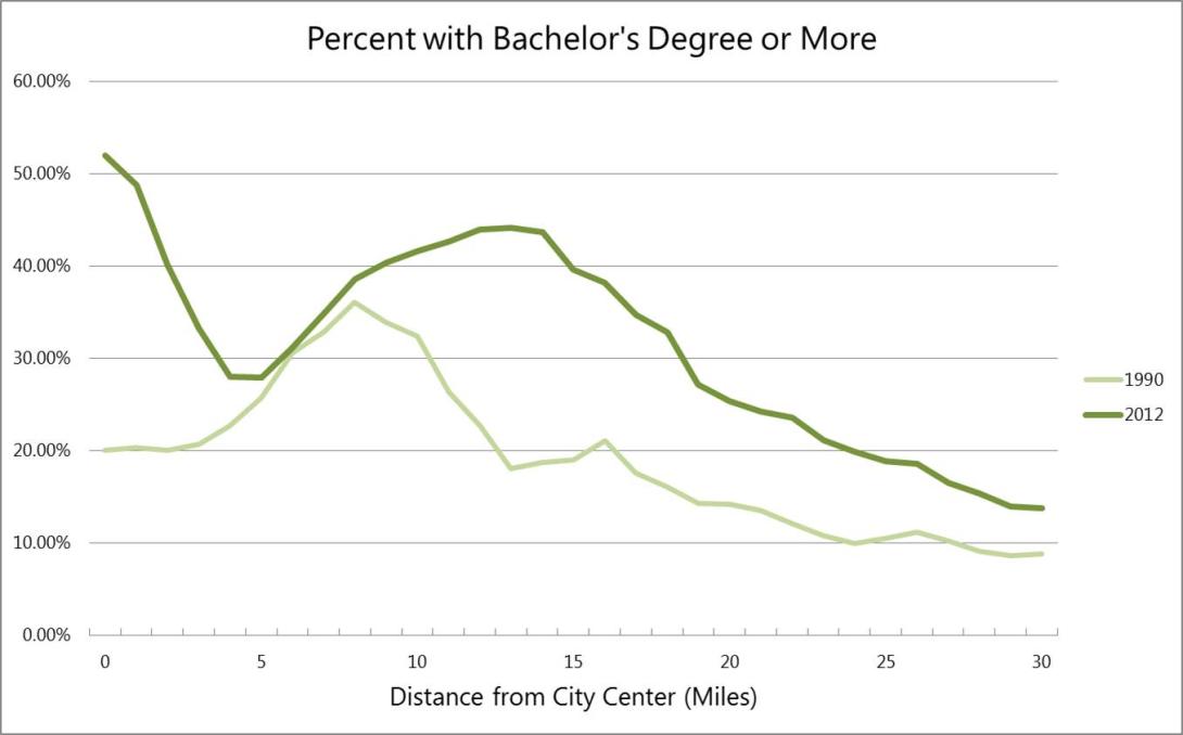
The hump has been replaced by an “S-curve.” This new graph reflects the “New Donut” model that is rapidly replacing the Old Donut.
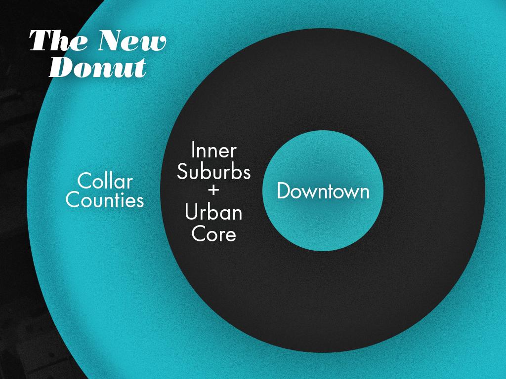
Like all models, the New Donut is far too simple, but it says something important about the trend in most major US metro areas today. Urban revitalization is in full swing – downtowns are doing better than they have been in decades. Newer outer suburbs also continue to boom and expand outward, accounting for most metropolitan population growth.
But in between there is a belt of stagnant urban areas and inner-ring suburbs. The upper-middle class residents who drove development in these areas have since retired or moved on to bigger and better homes farther away. The homes they’ve left are smaller than those preferred by upper-middle class buyers today and lack the amenities (or panache) of historic urban areas. Infrastructure is on its second or third life cycle and its age is starting to show. The original residents are increasingly being replaced by lower-income residents moving out of the inner city. Some are probably driven by rising rents in the newly revitalized core. Others may be taking advantage of the shift from public housing to Section 8 vouchers. Some are simply moving to the suburbs for the same reason the original residents did years ago as the bottom income bracket in the US is now high enough to make car ownership a possibility and give inner-city families a way out of failing school systems.
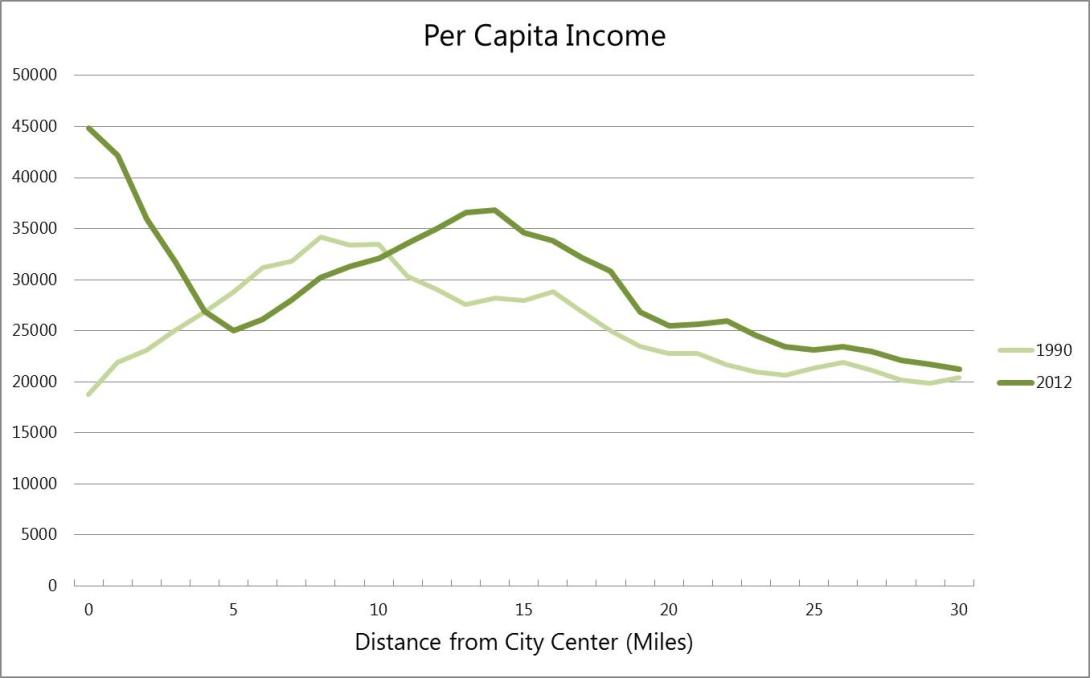
Some more graphs of Charlotte make the shift even more visible. The graph of education above correlates closely with the graph of per capita income:
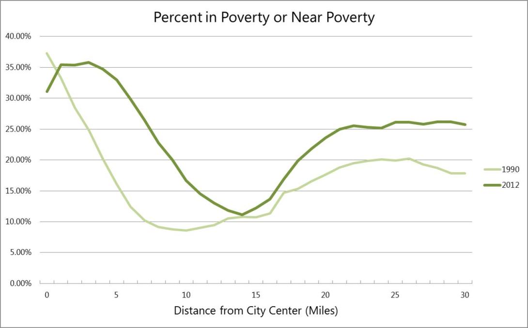
The shift is even clearer in the graph of poverty rates. The poverty graph – a smooth slope from high poverty rates in the middle of the city to low in the suburbs – has shifted about five miles to the right (outward). Interestingly, it hasn’t fallen as dramatically in the core as one might expect from the education graph, suggesting some of these places may simply be more diverse than they once were.
This pattern is visible in city after city, though it’s more exaggerated in some than in others. Here are graphs from three more of the country’s largest and fastest-growing metro areas: Atlanta, Denver, and Houston. All of them (including Charlotte above) have roughly symmetrical shapes with successive waves of new development emanating out from a single clear center. None are dominated by a large university and all except Denver have median home prices below the national average. All exist in states with few land use restrictions that might push people to the core and all are serviced by large urban highways that encourage sprawl. Yet all are experiencing the same population shift to varying degrees.
Atlanta, GA
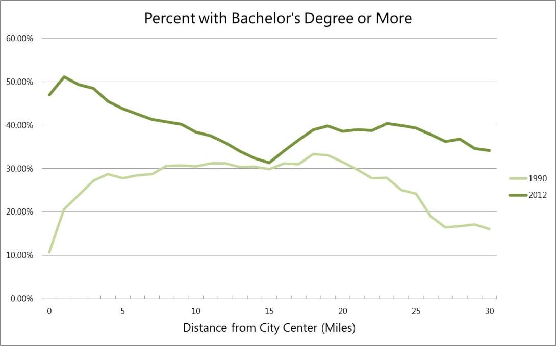
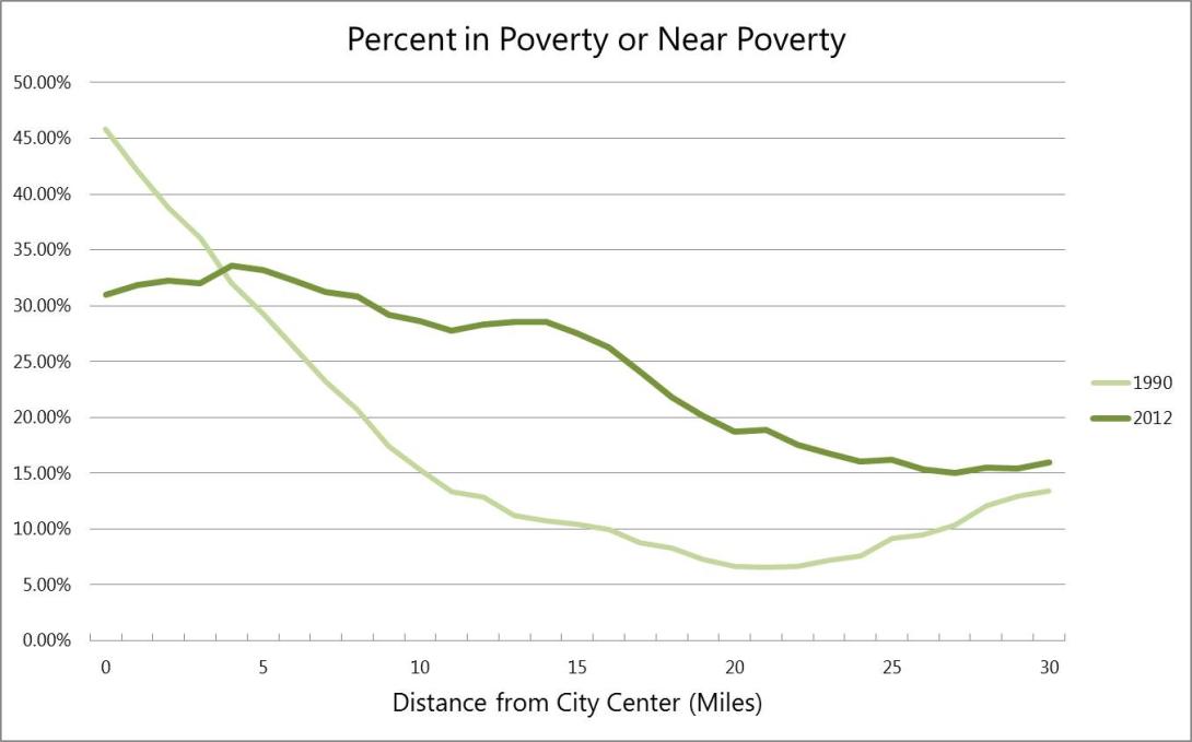
Denver, CO
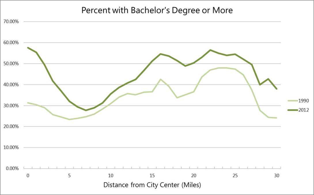
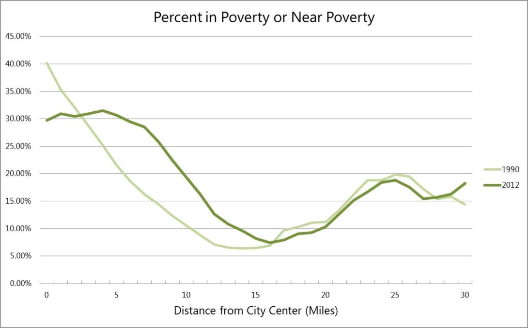
Houston, TX
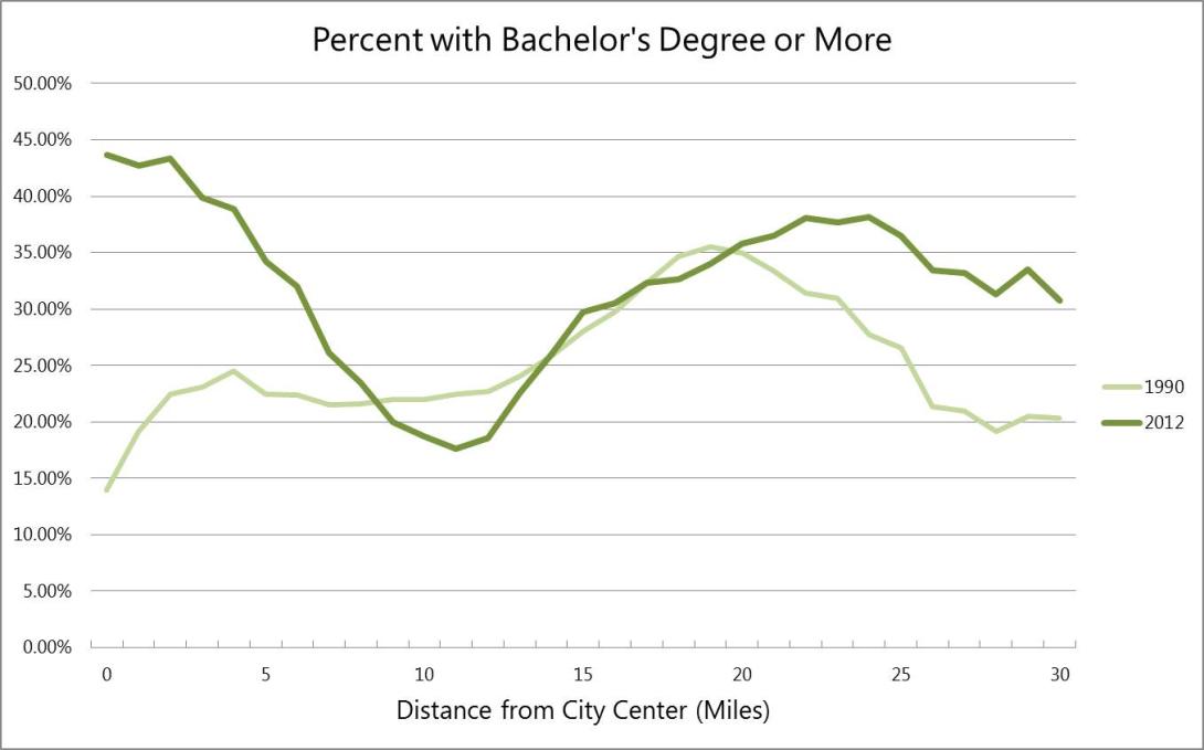
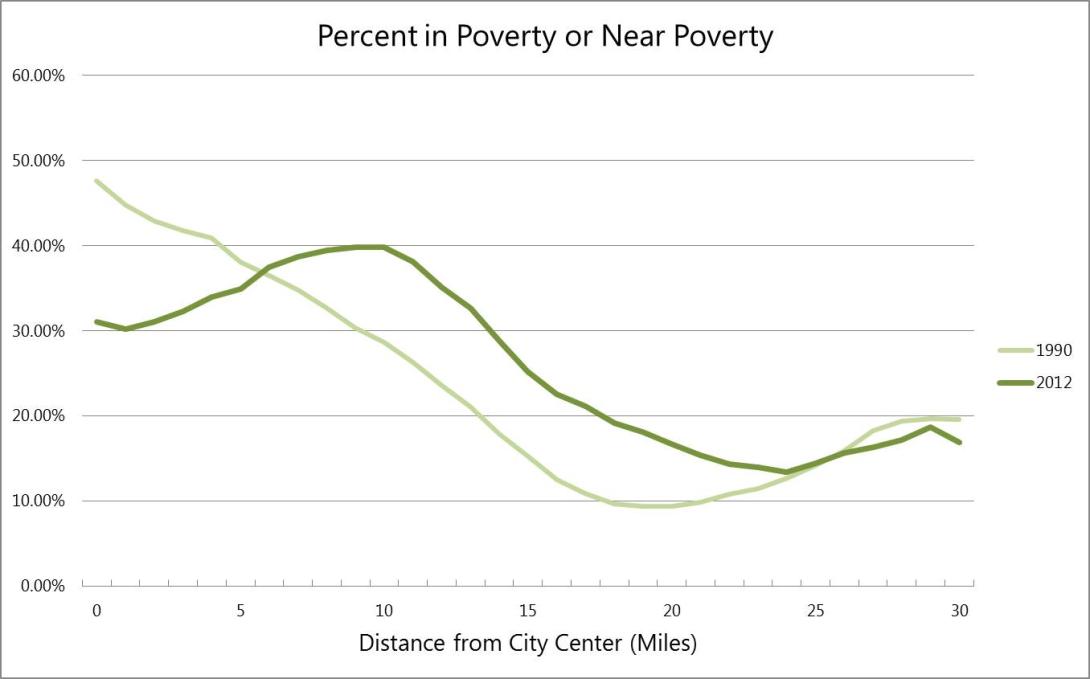
Why does this matter?
This is good and bad news. Much has been written about the revival of central cities. Attractive places will tend to draw people who are educated and wealthy enough to live where they choose rather than where they must. The shift of upper-middle class residents into poorer urban areas has the potential to make those neighborhoods healthier and more diverse. But it can also displace existing communities, especially when newer affluent residents work to block new construction that would absorb additional demand. San Francisco is exhibit A.
But for every San Francisco, there is also a Ferguson, MO, which this year became a poster child for the “inner-ring suburb.” The demographic shifts we are observing will certainly force us to rethink our stereotypes about urban poverty and get a new handle on what the needs of the very poor are.
I’ll be looking at more cities in the near future and delving deeper into the reasons for these changes.


