Even more evidence for the new donut

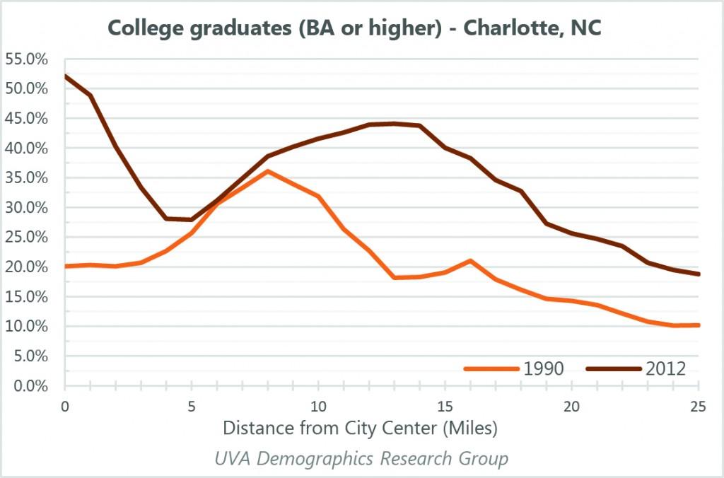
A while back, I wrote a post on the transformation of US cities over the last two decades, using Charlotte, Houston, Atlanta, and Denver as examples. That investigation, using graphs to show changes in the city from the core to the periphery, turned into a larger report that was just released today.
In order to get a better idea of what’s going on across the country, I looked at 9 variables in 66 cities, including the 50 largest metropolitan areas. You can read the report here or check out an interactive page with graphs from every city in the study. You can also compare cities across the country.
The study includes numerous findings, some of which I’ve already written about on StatChat, including the increasing proportion of young adults in city centers.
- Since 1990, downtowns and central neighborhoods in cities across the country have attracted significantly more educated and higher-income residents.
- Young adults (22-34 years old) have increased as a proportion of residents in the center of nearly every city in the country, while falling as a proportion across all other areas.
- Older residents (60 and up) form a smaller proportion of the inner-city population than they did in 1990.
- Most cities have seen a decrease in income and education levels several miles outside the core. How far outside depends on the city, with the sharpest drop being anywhere from 4 to 15 miles from the center.
- Households below the Federal poverty line are increasingly migrating outwards from the center of cities. The poverty rate has increased significantly several miles outside the core in many cities.
- Racial groups are less concentrated in particular rings than they once were.
- Most growth in housing units and population continues to come at the outer edges of cities. Residents of the outer ring tend to be more educated and have higher incomes. They are much less likely to be younger adults.
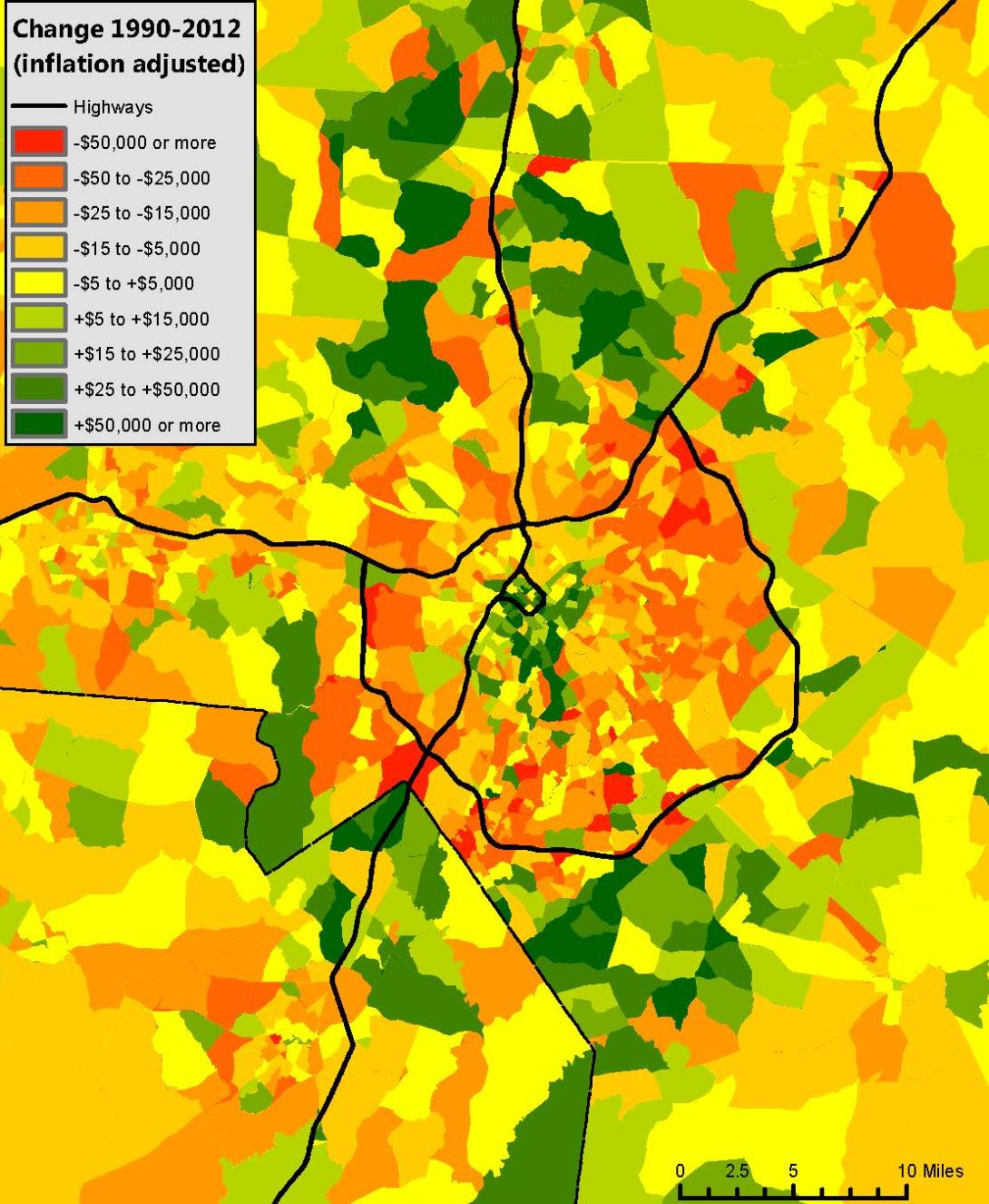
One of the most interesting things to me was translating the graphs into a map to see if the rings were actually visible. The graphs are meant to aggregate neighborhoods to allow us to see trends that may not be visible on a map, but it turns out that Charlotte, NC’s rings are visible immediately when one maps the change in median income from 1990 to 2012. In this map, 1990 income is inflation-adjusted to 2012 so that the two numbers are comparable.

See the report for a fuller discussion of what these graphs tell us or explore them yourself.


