U.S. House districts are colossal. What’s the right size?
The recent wave of populism and anti-establishment voting behavior in the United States made me want to take a closer look at how the structure of the U.S. political representation system might be contributing to the development of these sentiments. In what ways has this system fallen short, for example, in responding effectively to U.S. population growth and distribution over time—perhaps aggravating a sense of political alienation among voters?
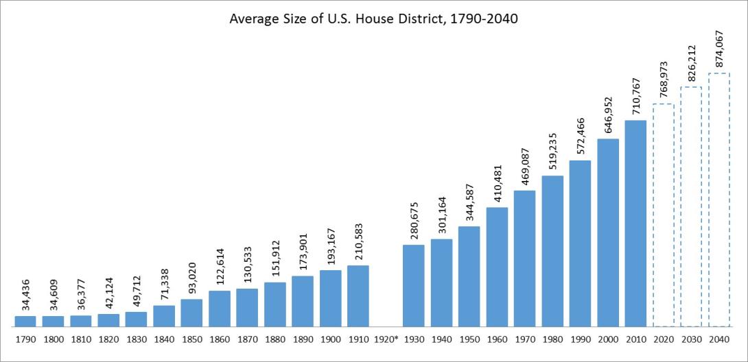
Part of the problem is that the number of seats in the U.S. House of Representatives—the “people’s chamber”—has been frozen at 435 for over a century despite the addition of four new states to the Union and an increase of nearly 220 million residents to our nation’s population during that time. As the graph below demonstrates, the average number of people served by each House member has increased from 34,436 in 1790 to 710,767 in 2010 and could potentially reach over 874,000 by 2040 if the cap on House size is not removed.

*No apportionment was made on the basis of the 1920 Census.
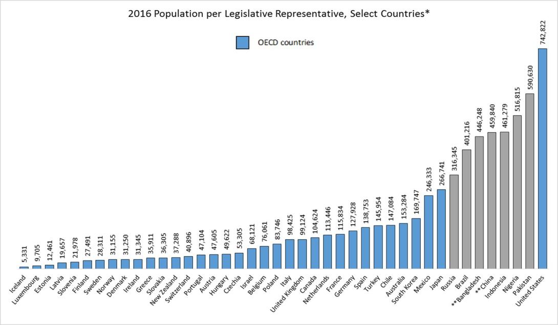
In the United States in 2016, House district size approached 745,000, which was the highest among the top ten most populous countries in the world (except for India) and was also the highest, by far, of the 35 member countries of the Organisation of Economic Co-operation and Development (OECD).

*Each country’s equivalent of the U.S. House of Representatives ** Legislators indirectly elected
Although it’s debatable at what point a House district becomes so large that it prevents productive communication among its representatives and constituents, it’s easy to understand how a case could be made that increasingly large districts might lead to a greater sense of political alienation among voters. Some suggest, for example, that the extremely large size of House districts today make it not only too easy but necessary for House members to put the national agendas of special interest groups and political parties ahead of the local needs of their constituents in order to win elections. Smaller districts, it is argued, would enable and require representatives to be more responsive to local needs. They might also reduce the effectiveness of gerrymandering and increase the demographic and political diversity of the House by enabling more people to run for office as a result of lower necessary campaign costs. The flip side of this argument, however, is that a larger House requiring interactions among a greater number of politicians might also induce political alienation among voters because it could complicate the logistics of the political process to a point of inefficiency.
Given the desire to strike the right balance between a House that is large enough to enable effective representation yet small enough to ensure efficient operations as the population grows, what’s the right size? If our nation’s original population-to-representative ratio of 30,000 to 1 were used today to apportion House seats, we would now have a House composed of over 10,000 members—hardly a model of efficiency.
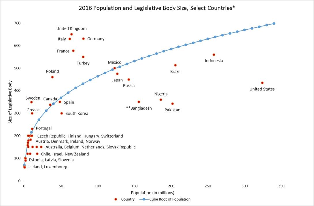
One frequently cited model suggests that the optimal size of a national legislative body is equal to the cube root of the country’s total population because this number enables legislators to communicate effectively both with their constituents and with one another. As the graph below demonstrates, lower chamber size in most OECD countries, except the United States, tends to approximate or exceed the cube root of each country’s population, while lower chambers (or equivalent legislative bodies) in the more populous countries tend to be undersized relative to population cube roots. The United States is in a group with Pakistan, Nigeria, and Bangladesh in having a legislative body size that is especially small relative to the cube root of its population. Proponents of the cube root model argue that increasing the U.S. House size to match the cube root of the U.S. population (687 based on 2016 population estimates) would put the United States more in line with other OECD countries.

*Each country’s equivalent of the U.S. House of Representatives **Some legislators indirectly elected
Theoretical debates about the ideal House size aside, at a practical level, it’s highly unlikely that current-day Congress would vote to increase its size. Unless a particular political party holding enough power in Washington becomes convinced that increasing the size of the House would benefit them in some way, it’s doubtful that politicians would pass legislation that would diminish their individual political powers.
It’s an important issue to be aware of, however, and it seems that even just a little boost in House size could go a long way to improve population-based political representation without jeopardizing House operations to a disabling degree. An increase to 687 House members, for example, (the cube root of the U.S. population in 2016) would reduce the population-to-representative ratio in the United States to around 472,000—a ratio that would come close to matching what it was in 1970 in the U.S. and at the very least be lower than the ratios currently found in Nigeria and Pakistan.


